
Retention Analytics
Understand why customers cancel, how well your retention offers perform, and which products have the highest churn — all from a dedicated analytics page inside WooCommerce Analytics.
Availability: Free
Page Navigation
- Current guide: Retention Analytics
- Where to open it: WordPress Admin -> WooCommerce -> Analytics -> Retention
- Direct route:
/wp-admin/admin.php?page=wc-admin&path=/analytics/arraysubs-retention - Section overview: Open overview
- Previous guide: Reports Hub
- Next guide: Subscription Performance Dashboard
- Troubleshooting: Audits, Logs, and Troubleshooting
Overview
Retention Analytics is a free analytics page that tracks every cancellation, scheduled cancellation, and retention offer interaction across your subscription business. It lives under the WooCommerce Analytics menu and provides summary cards, visual charts, a trend timeline, and a detailed activity log.
Navigate to WooCommerce → Analytics → Retention to open the page.
The page helps you answer questions like:
- How many subscriptions were cancelled this month?
- What are the top cancellation reasons?
- Are retention offers actually saving subscriptions?
- How much revenue has been retained through offers?
- Which products have the worst churn?
When to Use This
- Review cancellation patterns after a pricing change, product launch, or seasonal shift.
- Evaluate whether your retention offers (Discount, Pause, Downgrade, Contact Support) are effective.
- Compare churn rate and offer acceptance rate across different date ranges.
- Drill into a specific product to see its individual retention performance.
- Investigate specific cancellation events in the activity log.
Prerequisites
- ArraySubs core plugin activated
- WooCommerce 8.0+ with WooCommerce Admin (included by default)
- At least one subscription with cancellation activity for data to appear
- The Retention Flow configured with cancellation reasons and retention offers for full data capture
How It Works
When a customer cancels a subscription (or schedules a cancellation, undoes a cancellation, or interacts with a retention offer), the system logs the event in a dedicated arraysubs_retention_logs database table. Each log entry captures:
- The subscription and customer involved
- The cancellation reason selected
- Whether a retention offer was shown
- Whether the offer was accepted or declined
- The subscription's age and payment count at the time of the event
- The recurring amount at risk
The Retention Analytics page reads from this log table through REST API endpoints and renders the data as summary cards, charts, and a table.
Data Backfill
When you first activate ArraySubs, the system automatically backfills cancelled subscriptions from your store's existing history. This runs in the background using Action Scheduler, processing 50 subscriptions per batch. Once the backfill completes, all historical cancellations appear in the analytics.
The backfill runs automatically — no manual action is required. For stores with a large number of historical cancelled subscriptions, it may take several minutes to complete all batches.
Summary Cards
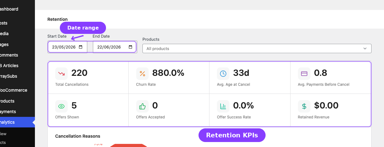
The top section shows 8 KPI cards that summarize retention performance for the selected date range.
| Card | Format | What it measures |
|---|---|---|
| Total Cancellations | Number | Total subscriptions cancelled in the period |
| Churn Rate | Percent | Cancellations ÷ live subscribers at period start × 100 |
| Avg. Age at Cancel | Days | Average subscription age (in days) at the time of cancellation |
| Avg. Payments Before Cancel | Number | Average number of successful payments before the customer cancelled |
| Offers Shown | Number | Total retention offer impressions shown to cancelling customers |
| Offers Accepted | Number | Total retention offers that customers accepted |
| Offer Success Rate | Percent | Offers accepted ÷ offers shown × 100 |
| Retained Revenue | Currency | Sum of monthly recurring amount from subscriptions saved by accepted offers that are still active |
How Churn Rate Is Calculated
The churn rate denominator counts all subscriptions that were in a live status (active, trial, or on-hold) at the start of the selected period. Subscriptions cancelled during the period are also counted in the baseline on their cancellation day for an accurate rate. This means the churn rate reflects the percentage of your subscriber base that churned during the period.
How Retained Revenue Is Calculated
Retained revenue sums the recurring_amount from all offer_accepted log entries where the subscription is still in an active status. If a customer accepted a retention offer but later cancelled anyway, that amount is excluded.
Churn Reasons Chart
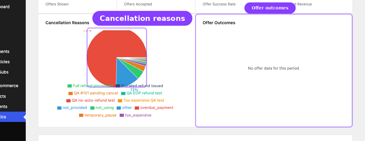
A pie chart visualizes the breakdown of cancellation reasons for the selected period.
Each slice represents one cancellation reason. The chart shows:
- Slice label — reason name and percentage (shown only for slices above 5% of total)
- Hover tooltip — reason name, count, and exact percentage
- Color coding — 8 distinct colors that rotate if you have more than 8 reasons
If no cancellation reason data exists for the selected period, the chart shows an empty state message.
Cancellation reasons come from the Retention Flow configuration. If "Require Cancellation Reason" is disabled, cancellations logged without a reason appear as not_provided in the chart.
Retention Offer Chart
A pie chart showing the outcome of retention offers.
The chart groups all accepted offer types (Discount, Pause, Downgrade, Contact Support) into a single green "Accepted" slice, and all declined offers into a red "Declined" slice. This gives you a quick visual of overall offer effectiveness.
If no offers were shown in the selected period, the chart shows an empty state.
Trend Chart
A line chart with four data series plotted over time.
| Line | Color | What it tracks |
|---|---|---|
| Cancellations | Red | Number of cancellations per interval |
| Offers Shown | Blue | Number of retention offers displayed per interval |
| Offers Accepted | Green | Number of offers accepted per interval |
| New Subscriptions | Purple | Number of new subscriptions created per interval |
The chart automatically selects the best interval granularity based on your date range:
| Date range | Interval |
|---|---|
| 60 days or fewer | Daily |
| 61–180 days | Weekly |
| More than 180 days | Monthly |
Hover over any data point to see the exact date and all four values in a tooltip.
The inclusion of the New Subscriptions line alongside cancellation data lets you see at a glance whether your subscriber base is growing or shrinking over time.
Activity Logs
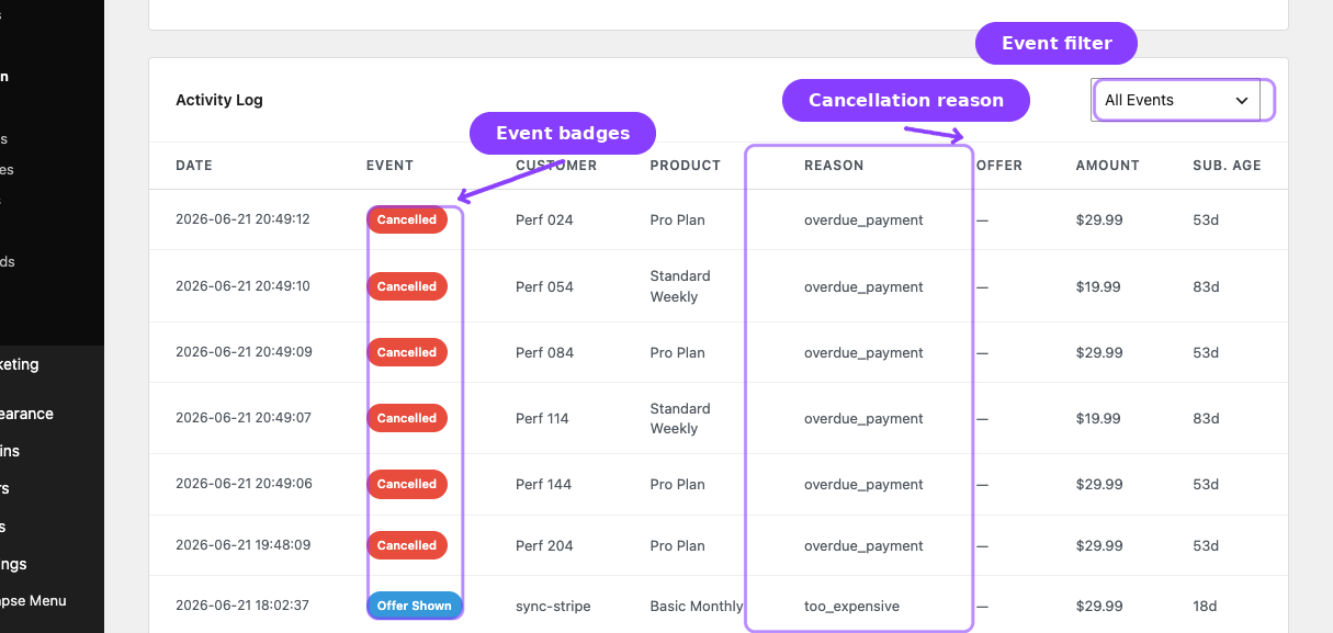
A paginated table showing every individual retention-related event.
Columns
| Column | What it shows |
|---|---|
| Date | Date and time of the event |
| Event | Event type as a color-coded badge |
| Customer | Customer name (or ID if name is unavailable) |
| Product | Subscription product name (or ID) |
| Reason | Cancellation reason text, or "—" if not applicable |
| Offer | Offer type shown or accepted, or "—" |
| Amount | Recurring subscription amount at the time of the event |
| Sub. Age | Subscription age in days at the time of the event |
Event Types
| Event | Badge color | When it is logged |
|---|---|---|
| Cancelled | Red | Customer or admin fully cancelled a subscription |
| Scheduled Cancel | Orange | Customer scheduled an end-of-term cancellation |
| Cancel Undone | Green | A scheduled cancellation was reversed (customer changed their mind) |
| Offer Shown | Blue | A retention offer modal was displayed to the customer |
| Offer Accepted | Green | Customer accepted the retention offer |
| Offer Declined | Gray | Customer declined the retention offer and continued with cancellation |
Filtering
A dropdown above the table lets you filter by event type. Select any single event type or "All Events" to see everything.
The activity log also respects the date range and product filters set in the top filter bar.
Pagination
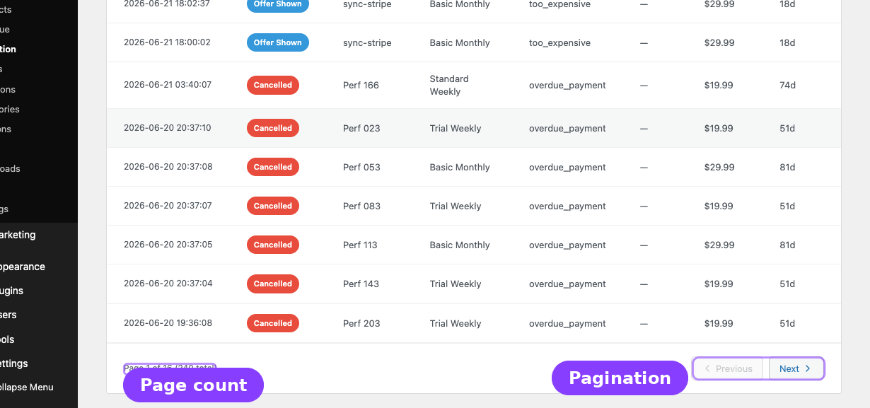
The log displays 15 events per page with Previous/Next navigation. The footer shows your current page number, total pages, and total events.
Filters
Three filters control all sections of the page simultaneously. Changes to any filter instantly refresh the summary cards, charts, and activity logs.
Date Range
Two date pickers set the start and end of the analysis period. The default range is the last 30 days.
The start date cannot be after the end date, and the end date cannot be before the start date.
Product Filter
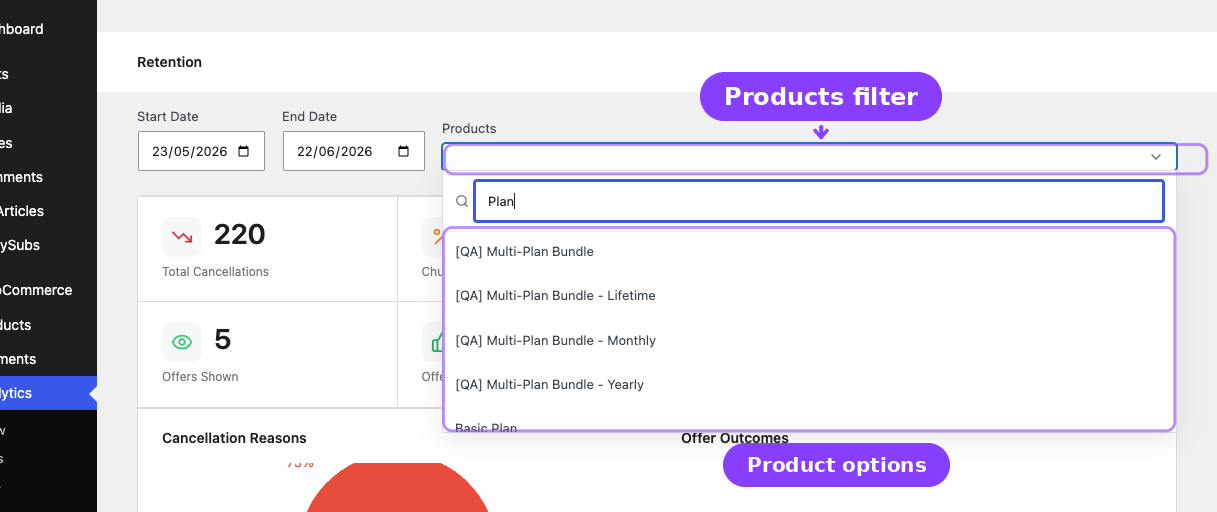
A searchable multi-select dropdown lets you narrow all analytics to one or more specific subscription products.
- Type at least one character to search by product name
- Supports simple products, variable products, and individual variations
- Selecting a variable product automatically includes all its variations
- Selecting a specific variation filters to that variation only
- Selected products appear as removable tags
- A "clear all" button removes all product filters
When no products are selected, analytics cover all subscription products.
Real-Life Use Cases
Post-Price-Increase Review
A merchant raised subscription prices 2 weeks ago. They set the date range to start on the price change date and check the Total Cancellations and Churn Rate cards. The Churn Reasons Chart confirms that "Too expensive" spiked, so they create a targeted retention discount for customers who cite that reason.
Evaluating Retention Offers
A store has been running retention offers (Discount + Pause) for 3 months. They set the date range to the full 3-month period and check the Offer Success Rate card. At 25%, they decide to add a Downgrade offer as a third option, then re-evaluate next month.
Product-Level Churn Investigation
A store sells 5 subscription products and notices overall churn rising. They use the product filter to check each product individually. Product C shows 3x the churn rate of others, with "Not enough value" as the top reason. They improve Product C's content offering.
Activity Log Deep Dive
A support agent investigates a customer complaint about unwanted auto-renewal. They open the Activity Log, filter by Scheduled Cancel, and find that the customer scheduled a cancellation but it was later undone. The log shows the exact date and whether a retention offer was involved, helping the agent explain the situation.
Edge Cases and Important Notes
- Backfill only covers cancellations. Historical offer interactions (shown, accepted, declined) cannot be reconstructed because the retention flow only logs these events in real time. The backfill creates
cancelledlog entries for historical cancelled subscriptions. - Churn rate can exceed 100% if more subscriptions were cancelled than existed at the start of the period (for example, if many were created and cancelled within the same short period).
- Retained revenue is a live snapshot. If a saved subscription later cancels, its amount is removed from the retained revenue total.
- Product filter uses scope IDs. Selecting a parent variable product includes all its variation IDs in the filter query, ensuring complete coverage without selecting each variation individually.
- The page lives inside WooCommerce Analytics. It replaces the WooCommerce layout when active and restores it when you navigate away. This is seamless — use the WooCommerce Analytics sidebar menu to switch between reports.
Related Guides
- Reports Hub — Central directory of all analytics and reports.
- Subscription Performance Dashboard — KPI cards, charts, and leaderboards on the WC Analytics Overview.
- WooCommerce Analytics Extension — Subscription filters and metrics in WC Analytics reports.
- Lifecycle Management — Status transitions that drive churn metrics.
- Cancellation Setup — Configure cancellation timing and reasons that feed this analytics page.
- Retention Offers — Configure the retention offers tracked by these metrics.
- Retention Use Cases — Real-life scenarios for applying retention analytics insights.
FAQ
Where do I find Retention Analytics?
Navigate to WooCommerce → Analytics → Retention in the WordPress admin sidebar. It appears as a submenu item under the Analytics section.
Is this a free or Pro feature?
Retention Analytics is free — it is included in the core ArraySubs plugin. No Pro license is required.
Why do some card values show zero?
If no cancellations or retention offers occurred during the selected date range, the cards show zero. Try expanding the date range or checking that the Retention Flow is configured with cancellation reasons and offers.
Why is the churn rate different from the Performance Dashboard?
The Subscription Performance Dashboard (Pro) calculates churn rate using cancelled ÷ (active at period start + new in period). Retention Analytics uses cancelled ÷ live subscribers at period start. The denominators differ slightly, which can produce different percentages for the same period.
Does the product filter support variable products?
Yes. Selecting a variable (parent) product automatically includes all its variations. You can also select individual variations for more precise filtering.
How far back can I view data?
As far back as your subscription history goes. The backfill processes all historical cancelled subscriptions. The only limitation is that offer interaction data (shown, accepted, declined) is only available from the point when ArraySubs was actively logging events.
Can I export the activity log?
The activity log does not currently have a built-in export button. Use the Subscription CSV export from ArraySubs → Subscriptions for bulk subscription data exports.