
Field Types Reference
ProComplete reference for all 28 element types available in the Checkout Builder — properties, type-specific settings, validation rules, and storage format.
Availability: Pro
Page Navigation
- Current guide: Field Types Reference
- Where to open it: Storefront checkout and WordPress Admin -> ArraySubs -> Checkout Builder
- Direct route:
/wp-admin/admin.php?page=arraysubs-mainadmin#/checkout-builder - Section overview: Open overview
- Previous guide: stripe
- Next guide: README
- Troubleshooting: Audits, Logs, and Troubleshooting
Overview
The Checkout Builder supports 28 element types across three categories. Every custom input field stores its data as order meta with the _arraysubs_cf_ prefix. Layout elements do not store data — they only control the visual structure of the form.
Current Field Palette
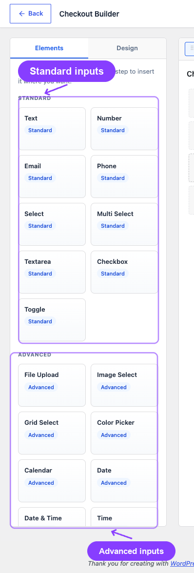
The current code registry exposes these field types:
| Category | Field Types |
|---|---|
| Standard inputs | Text, Number, Email, Phone, Select, Multi Select, Textarea, Checkbox, Toggle |
| Advanced inputs | File Upload, Image Select, Grid Select, Color Picker, Calendar, Date, Date & Time, Time, Date Range |
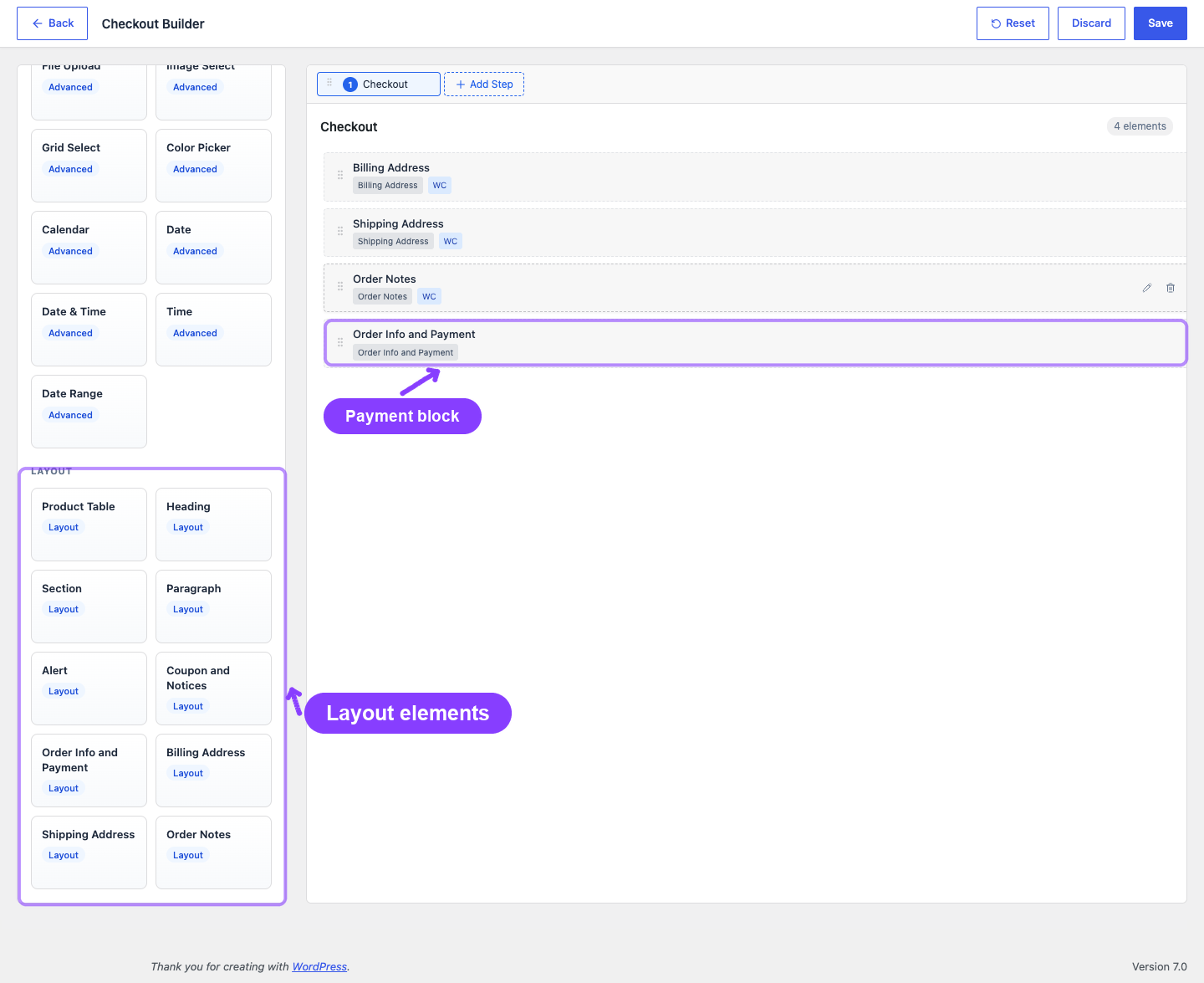
| Layout and WooCommerce blocks | Product Table, Heading, Section, Paragraph, Alert, Coupon and Notices, Order Info and Payment, Billing Address, Shipping Address, Order Notes |
Locked WooCommerce fields cannot be removed from the checkout layout: Billing Email, Billing First Name, Billing Last Name, and Billing Country.
Custom input field values are stored with the _arraysubs_cf_ meta prefix and can be displayed later on subscription detail screens when the Checkout Builder display settings allow it.
Common Field Settings
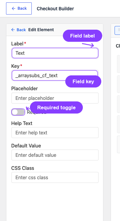
The inline settings sidebar shows the fields that apply to the selected element type:
| Property | Description | Required |
|---|---|---|
| Label | Display label shown above the field | Yes |
| Key | Meta key slug (auto-generated from label, prefixed with _arraysubs_cf_). Must be unique. |
Yes |
| Placeholder | Hint text shown inside the empty input field | No |
| Help text | Descriptive text shown below input fields | No |
| Required | Whether an input field must be filled before checkout submission | No |
| Default value | Pre-filled value when an input field loads | No |
| CSS class | Custom CSS class names added to the field wrapper | No |
| Type settings | Field-specific options such as select choices, file limits, product table filters, or layout content | No |
| Section columns | Column count for Section layout elements: 1, 2, or 3 columns | No |
| Visibility rules | Conditional Show When rules for input fields, shown when another non-layout field is available to reference (see Checkout Builder Overview) | No |
Standard Input Fields
Text
Single-line text input for short free-form data.
| Setting | Details |
|---|---|
| HTML element | <input type="text"> |
| Validation | Required check only |
| Storage | String value |
| Use cases | Company name, referral code, special instructions |
Number
Numeric input with optional min/max boundaries.
| Setting | Details |
|---|---|
| HTML element | <input type="number"> |
| Type settings | min (minimum value), max (maximum value), step (increment) |
| Validation | Must be numeric; checked against min/max if set |
| Storage | Numeric string |
| Use cases | Team size, quantity preferences, age, budget amount |
Email address input with format validation.
| Setting | Details |
|---|---|
| HTML element | <input type="email"> |
| Validation | WordPress is_email() check |
| Storage | Email string |
| Use cases | Alternative contact email, billing contact email, team member email |
Phone
Phone number input with format validation.
| Setting | Details |
|---|---|
| HTML element | <input type="tel"> |
| Type settings | format_mask (optional display format) |
| Validation | Regex: minimum 7 digits, allows +, (), -, and spaces |
| Storage | Phone string |
| Use cases | Mobile number, emergency contact, WhatsApp number |
Select
Dropdown with predefined options.
| Setting | Details |
|---|---|
| HTML element | <select> |
| Type settings | options — array of {value, label} pairs |
| Validation | Selected value must be in the options list |
| Storage | Selected value string |
| Use cases | Plan tier selection, preferred language, T-shirt size |
Multi-Select
Searchable dropdown allowing multiple selections.
| Setting | Details |
|---|---|
| HTML element | Multi-select with search |
| Type settings | options — array of {value, label} pairs; multi: true |
| Validation | All selected values must be in the options list |
| Storage | Array of selected value strings |
| Use cases | Interests/topics, dietary restrictions, services needed |
Textarea
Multi-line text area for longer free-form input.
| Setting | Details |
|---|---|
| HTML element | <textarea> |
| Type settings | max_length (optional character limit) |
| Validation | Required check only |
| Storage | String value |
| Use cases | Delivery instructions, project description, special requirements |
Checkbox
Single boolean checkbox.
| Setting | Details |
|---|---|
| HTML element | <input type="checkbox"> |
| Validation | If required, must be checked |
| Storage | 1 (checked) or empty |
| Use cases | Terms acceptance, opt-in consent, newsletter signup |
Toggle
On/off switch — a visual variant of checkbox.
| Setting | Details |
|---|---|
| HTML element | Toggle switch component |
| Validation | If required, must be enabled |
| Storage | 1 (on) or empty |
| Use cases | Auto-renew preference, premium add-on selection, marketing opt-in |
Advanced Input Fields
File Upload
File attachment with type and size validation.
| Setting | Details |
|---|---|
| Type settings | allowed_types (e.g., image, pdf, doc), max_file_size (MB), max_file_count |
| Validation | File type allowlist, size limit, count limit |
| Storage | WordPress attachment ID (or array of IDs for multiple files) |
| File location | wp-content/uploads/arraysubs-checkout-uploads/{order_id}/ |
| Use cases | ID verification, logo upload, prescription documents |
File Upload fields only work when Allow File Uploads is turned on in Checkout Builder Settings. The global Default Max File Size (MB) setting applies as an upper bound, but individual upload fields can set a lower limit.
Image Select
Visual image-based selector where customers choose by clicking images.
| Setting | Details |
|---|---|
| Type settings | options — array of {image_url, label} pairs; multi (boolean: allow multiple) |
| Validation | Selection required if field is required |
| Storage | Selected value(s) |
| Use cases | Color/pattern choice, product style, box design selection |
Grid Select
Grid of option cards with labels and descriptions.
| Setting | Details |
|---|---|
| Type settings | options — array of {label, description} pairs; columns (2, 3, or 4); multi (boolean) |
| Validation | Selection required if field is required |
| Storage | Selected value(s) |
| Use cases | Service tier selection, meal plan choice, frequency preference |
Color Picker
Interactive color selection tool.
| Setting | Details |
|---|---|
| Type settings | default_color (hex), allowed_palette (optional array of hex values) |
| Validation | Must be a valid hex color |
| Storage | Hex color string (e.g., #ff5733) |
| Use cases | Brand color selection, product customization, packaging theme |
Calendar
Date picker with a visual calendar widget.
| Setting | Details |
|---|---|
| Type settings | min_date, max_date, disabled_dates, date_format |
| Validation | Must parse as valid date; checked against min/max if set |
| Storage | ISO date string |
| Use cases | Preferred start date, delivery date, event date |
Date
Standard date input with configurable format.
| Setting | Details |
|---|---|
| Type settings | min_date, max_date, format (DD/MM/YYYY, MM/DD/YYYY, etc.) |
| Validation | Must parse as valid date; checked against min/max |
| Storage | Date string |
| Use cases | Date of birth, membership start date, anniversary date |
Date & Time
Combined date and time input.
| Setting | Details |
|---|---|
| Type settings | min_datetime, max_datetime, time_step_interval |
| Validation | Must parse as valid datetime |
| Storage | ISO datetime string |
| Use cases | Appointment booking, consultation time, scheduled start |
Time
Time-only picker.
| Setting | Details |
|---|---|
| Type settings | format (12h or 24h), min_time, max_time, step |
| Validation | Must be valid time |
| Storage | Time string (HH:MM or HH:MM:SS) |
| Use cases | Preferred delivery time, consultation slot, daily reminder time |
Date Range
Start-and-end date pair picker.
| Setting | Details |
|---|---|
| Type settings | min_date, max_date, max_span_days |
| Validation | Both dates required; end must be after start; span within limit |
| Storage | Object with start and end date strings |
| Use cases | Travel dates, rental period, event duration |
Layout Elements
Layout elements do not collect data. They control the structure and visual flow of the checkout form.
Heading
Section heading rendered as H2, H3, or H4.
| Setting | Details |
|---|---|
| Type settings | content (heading text), heading_level (h2, h3, or h4) |
| Purpose | Visual separation between form sections |
Section
Container block with column support.
| Setting | Details |
|---|---|
| Type settings | columns (1, 2, or 3), children (array of field arrays, one per column) |
| Purpose | Group related fields in a bordered container; enable side-by-side layout |
Sections are the primary tool for multi-column layouts. Drop fields into a section's columns for side-by-side arrangement. Fields within a column stack vertically.
Paragraph
Informational text block.
| Setting | Details |
|---|---|
| Type settings | content (HTML text) |
| Purpose | Instructions, disclaimers, informational notes within the form |
Alert
Callout box with visual styling.
| Setting | Details |
|---|---|
| Type settings | content (message text), alert_type (info, success, warning, error), dismissible (boolean) |
| Purpose | Important notices, warnings, or success messages |
Product Table
Product selector/table that can display products directly inside checkout.
| Setting | Details |
|---|---|
| Type settings | Product IDs, category IDs, and visible columns such as thumbnail, title, quantity, SKU, price, sale price, and short description |
| Purpose | Lets customers add eligible products from checkout without leaving the checkout page |
Billing Address
WooCommerce's native billing address field group.
| Setting | Details |
|---|---|
| Type settings | fields_config (show/hide/relabel individual address fields), address_countries (country filter) |
| Purpose | Standard billing address collection |
You can configure which individual address fields are visible within this element and filter available countries.
Shipping Address
WooCommerce's native shipping address field group.
| Setting | Details |
|---|---|
| Type settings | fields_config (show/hide/relabel individual address fields), address_countries (country filter) |
| Purpose | Shipping address collection (when "Ship to a different address" is checked) |
Order Notes
WooCommerce's order notes section.
| Setting | Details |
|---|---|
| Type settings | fields_config (show/hide per WC order notes field) |
| Purpose | Customer notes and special instructions |
Coupon and Notices
WooCommerce coupon form and checkout notices area.
| Setting | Details |
|---|---|
| Purpose | Renders the coupon entry form and any WooCommerce checkout messages. Place this where you want coupons to appear in the form flow. |
Order Info and Payment
WooCommerce order review table and payment method selector.
| Setting | Details |
|---|---|
| Purpose | Required. Renders the order summary, totals, and payment method selection with the Place Order button. Can only exist once. |
This element is mandatory. If removed, it is automatically re-added at the end of the last step. Without it, customers cannot review their order or select a payment method.
Field Key Format
All custom input fields store their values with the prefix _arraysubs_cf_:
_arraysubs_cf_company_name
_arraysubs_cf_t_shirt_size
_arraysubs_cf_preferred_start_date
The key is automatically generated from the field label (lowercased, spaces replaced with underscores, special characters removed). You can also set a custom key manually — just ensure it's unique across all fields.
Layout elements (headings, sections, paragraphs, alerts) do not have meta keys because they don't store data.
Validation Summary
| Field Type | Validation Rules |
|---|---|
| Text, Textarea | Required check only |
| Number | Numeric check + min/max range |
is_email() format check |
|
| Phone | Regex: 7+ digits, allows +()- and spaces |
| Select | Value must be in defined options |
| Multi-Select | All values must be in defined options |
| Checkbox, Toggle | If required, must be checked/on |
| File Upload | File type allowlist + size/count limits |
| Image Select, Grid Select | Selection required if field is required |
| Color Picker | Valid hex color format |
| Calendar, Date | Parseable date + min/max date range |
| Date & Time | Parseable datetime + min/max range |
| Time | Valid time format |
| Date Range | Both dates required, end > start, max span |
Validation runs at checkout submission time (not during step transitions in multi-step mode). Fields hidden by conditional visibility rules are not validated.
Related Docs
- Checkout Builder Overview — Builder interface, design panel, and settings
- Checkout Builder Use Cases — Real-world examples using these field types